Showing posts with label graphic design. Show all posts

Tuesday, 16 March 2010

Bert Monroy

A twist on my favourite art movement, photorealism, Bert Monroy specialises in digital photorealism.


"Red Truck" 2004


"Peter's Ice Cream" 1991 (!!)


"Oakland" 2004


"Oakland" 2004 (detail)

"As a photo-realist painter, I have often been asked why I don’t just take a photograph. Good question, when you consider my paintings look like photographs. Well, for one thing, I’m not a photographer. To me, it is not the destination that is important—it is the journey.
The incredible challenge of recreating reality is my motivation." -- Bert Monroy


"Lunch In Tiburon" (date?)


"The Sidelines" 1999

Monroy started out in a career in advertising and since 1984 has been making what he calls "digital paintings". They're really quite something, and his website allows you to zoom in on some details and the thought that the image isn't actually there, it's all made up of random shapes and shadows, it's a trip.


"Damen" 2006


"Damen" 2006 (detail)

Here are some statistics for graphic design nerds like me:

"This is my latest and most ambitious digital painting of a Chicago scene unveiled at Photoshop World in Miami on March 22, 2006.
It is a panorama of the Damen Station on the Blue Line of the Chicago Transit Authority.
Adobe Illustrator was used for generating the majority of the basic shapes as well as all the buildings in the Chicago skyline.
The rest was created in Photoshop.
• The image size is 40 inches by 120 inches.
• The flattened file weighs in at 1.7 Gigabytes.
• It took eleven months (close to 2,000 hours) to create.
• The painting is comprised of close to fifty individual Photoshop files.
• Taking a cumulative total of all the files, the overall image contains over 15,000 layers.
• Over 500 alpha channels were used for various effects.
• Over 250,000 paths make up the multitude of shapes throughout the scene.

Saturday, 31 January 2009

Empire mash-ups

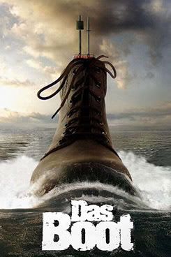
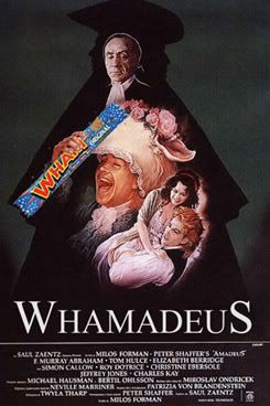
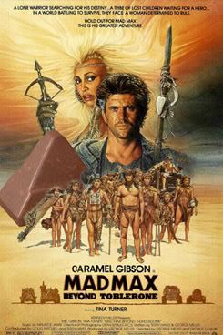
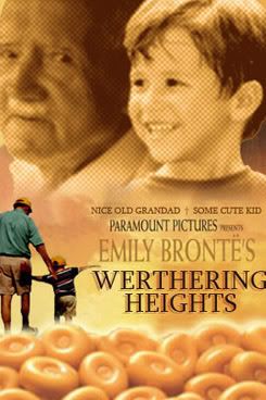
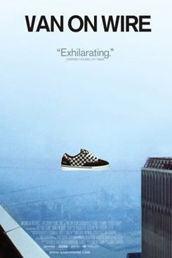
For someone with a love of bad puns, Empire Magazine's online poster mash-up competitions are a dream come true. My favourites from the sweets and shoe mash-ups:


And one last one because of this post:

Monday, 20 October 2008

Mystery Jets, Twenty One

Whenever autumn comes around, I start to think about my annual "top ten" lists. 2008 was a bit of a strange year, because even though I listened to quite a few new albums that came out in '08, very few of them actually stuck with me. Which ones stuck you'll probably find out in December (who can resist "best of"-lists in December? I sure can't!), but one of them will definitely be Twenty One by the Mystery Jets.

In 2006, I missed out on their debut Making Dens, but their single for 'Young Love', featuring the aggravatingly young and talented Laura Marling caught my ear and listening to Twenty One, I was definitely impressed. It gets said quite a lot since two of the band members are father and son, but the Mystery Jets are such an unusual, great band; the fact that they got their start on Eel Pie Island probably says enough.

Everyone probably has their own definition of what "pop music" is exactly, and a lot of people think "pop" is automatically a derogatory term, but when I say that Twenty One is perfect pop, I mean it as the biggest compliment. Beautifully crafted songs, with great lyrics and incredible heartache mixed in with deliriously happy bounce-around-the-room tunes; it's definitely one of the best albums this year.

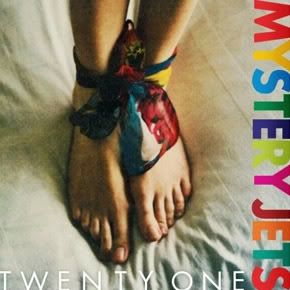
As the saying goes, you should never judge a book by its cover, but a good record sleeve is an amazing thing, and Twenty One's got it:


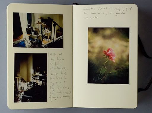
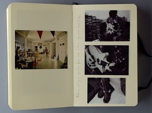
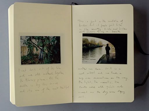
I love the unusual colours and light in the photograph. A chap named Nacho Alegre created the artwork for the album, and you can check out his photographic diaries of the time he spent with the Jets during the recording of the album, which is a great bonus for curious music fans like me who love knowing how their favourite albums came to be.


Songs:
Mystery Jets, Behind the Bunhouse (amazon)
Mystery Jets, Two Doors Down (amazon)


More on the Mystery Jets:
· Mystery Jets on Wikipedia.
· 'Two Doors Down'-video on YouTube.
· 'Half In Love With Elizabeth'-video on YouTube.

Thursday, 11 September 2008

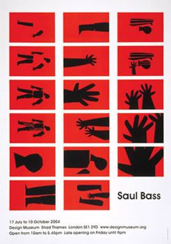
Saul Bass

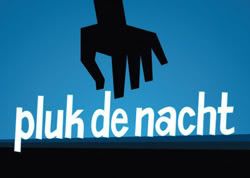
As I was walking home yesterday, I came across a poster for Pluk de Nacht, a film festival in Amsterdam that shows previously unreleased films. I was walking by and not paying much attention, but still the poster caught my eye and I immediately thought of Saul Bass.


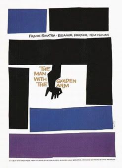
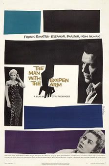
Saul Bass was a graphic designer, most famous for his work on film posters for Alfred Hitchcock, Stanley Kubrick and Martin Scorsese; his most iconic poster might just be the one he made for Otto Preminger's The Man with the Golden Arm:


Bass was also very well known for his amazing animated title sequences for several films; Hitchcock's Vertigo and Psycho of course, but also 1991's GoodFellas and even The Age of Innocence - how's that for diversity? My favourite is the title sequence he made for North by Northwest, it's just genius:


Before he started working on films, Bass was already a sought-after graphic designer. In his lifetime he created corporate identities and logos for companies such as Continental Airlines, the Girl Scouts of the USA (!), Wesson Oil and Geffen Records. Wikipedia reports that at one point, his AT&T Bell System logo had a 93 percent recognition rate in the United States.

Saul Bass is a legend in graphic design, you can find an interesting biography with a timeline of his major works on the Design Museum's website.


More interesting websites and blogs on Saul Bass:
· saulbass.tv: a very stylish website dedicated to saul, focusing mostly on his poster designs.
· cinemacom.com/saul-bass: a collection of his film posters.
· a great post on Design*Sponge about Saul Bass' children's book, 'Henri's Walk To Paris'.

Plus, I highly recommend these YouTube-videos:
· a little gem that popped up on YouTube a few months ago: Saul Bass vs Star Wars
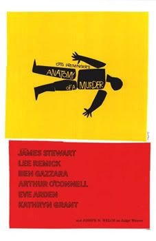
· opening sequence from Anatomy of a Murder
· opening sequence from The Man With the Golden Arm
· opening sequence from Vertigo


Thursday, 19 June 2008

typography on youtube

For the most part, YouTube is what happens when people have too much time on their hands, but sometimes, you come across some really interesting home-made videos. A while back I read a blog (it might be by Empire magazine) on these odd videos that depict great scenes from films using only typography. As a graphic design student I absolutely loathed my typography classes, but I'm amazed at how creative some of these videos are. Some of my favourites:

Quentin Tarantino's films lend themselves very well to this sort of thing:


'Shouty Al' Pacino in the Devil's Advocate:


One of the great speeches from Patton:


All in all, Austin Powers: the Spy Who Shagged Me was utterly forgettable, except for this bit of dialogue:


Edit: original article which inspired this blog, alwayswatching.com's Great Scenes from TV and Film, Told Using Only Typography (and Sound)